Stop Building Dashboards Nobody Looks At
53% of SaaS licenses go untouched for a full year. More dashboards won't fix that. Here's what the data says—and what founders are doing instead in 2026.

Key Takeaways
- In 2026, the average organization manages 305 SaaS applications (Zylo, 2026 SaaS Management Index)—each one with its own dashboard
- In 2026, 53% of SaaS licenses went without a single login for an entire year (BetterCloud, State of SaaSOps)
- Dashboards are passive—they show you what happened but can't tell you what to do about it
- AI agents that answer plain-language questions replace 15 browser tabs with a single conversation
- The fix isn't a better dashboard. It's making the question easier to ask.
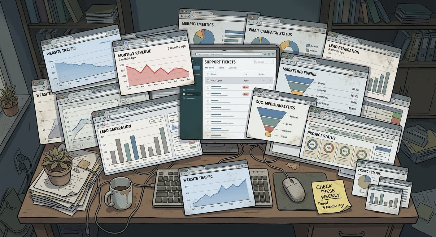
It's Monday morning. You need to know how last week went.
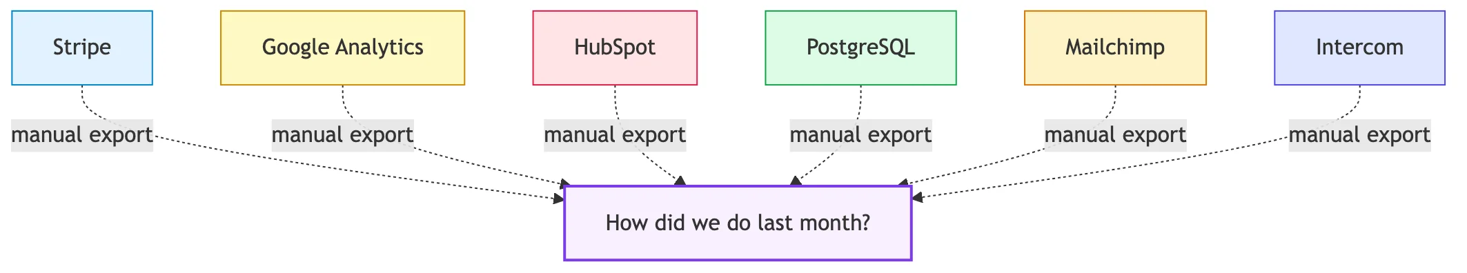
So you open Stripe. Then HubSpot. Then Google Analytics. Then your database admin tool. Then a spreadsheet where you track the three metrics that don't live anywhere else.
Forty-five minutes later, you have a rough picture. You paste some numbers into a Slack message, fire off a quick update to your co-founder, and get on with your day.
This is business intelligence in 2026 for most founders. Not Tableau. Not Looker. Not some sleek BI platform with a $2,000/month price tag. Just tabs. A lot of tabs. And some copy-paste arithmetic.
I've spent more Monday mornings than I'd like doing exactly this. The thing that finally bothered me wasn't the time. It was realizing that after all that work, I still wasn't confident in the numbers.
Why Do Founders Have So Many Dashboards?
Every SaaS tool you pay for comes with one. In 2026, Zylo's SaaS Management Index found that the average organization manages 305 SaaS applications. Individual teams average 60 to 80 apps, according to Productiv's State of SaaS report. Each one ships with a dashboard designed to keep you inside that particular product as long as possible.
For a 5-person startup, a typical stack looks like this:
- Payments: Stripe
- CRM: HubSpot or Pipedrive
- Analytics: Google Analytics, Mixpanel, or Amplitude
- Support: Intercom or Zendesk
- Docs: Notion or Confluence
- Communication: Slack
- Code: GitHub
- Infrastructure: AWS Console or Vercel
- Accounting: QuickBooks or Xero
- Email marketing: Mailchimp or ConvertKit
- Project management: Linear or Asana
That's 11 tools before anything specialized. Eleven dashboards. Eleven different logins. Each one shows a narrow slice of your business through its own lens. None of them talk to each other. The only integration layer is you, a browser, and a spreadsheet.
What Is the Real Cost of Dashboard Sprawl?
Dashboard sprawl costs more than most founders realize—in money, time, and decision quality. Zylo's 2026 data shows that SaaS spend increased 8% year-over-year even while the number of applications in most portfolios stayed flat. Renewing those tools isn't getting cheaper either: 79% of IT leaders encountered price increases at renewal time, and 77% reported unexpected charges after signing.
The time cost is worse.
Productiv reports that 48% of IT teams spend too much time manually managing applications. For a solo founder or a team of five, you don't have an IT team. You are the IT team, the data team, and the BI analyst.
When I tracked my own time, I was spending about 3 hours a week pulling data from different tools, normalizing date ranges, combining numbers in a spreadsheet, and trying to figure out why the totals didn't match. That's 150 hours a year. Even after all that manual work, the insights rarely made it anywhere useful.
A 2019 analysis by VentureBeat, drawing on IBM research, found that 87% of data science projects never make it into production. The primary reason: organizational silos and the gap between generating an insight and acting on it. If that's true for companies with dedicated data teams, imagine what the number looks like for a founder working solo with a spreadsheet.
Why Don't People Actually Use Their Dashboards?
In 2026, BetterCloud's research found that 53% of SaaS licenses go without a single login for an entire year. Productiv's data tells a similar story: only about 45% of SaaS licenses are actively used. If people aren't logging into their tools, they are definitely not checking the dashboards inside those tools.
The reason isn't laziness. It's the mental overhead of the ritual.
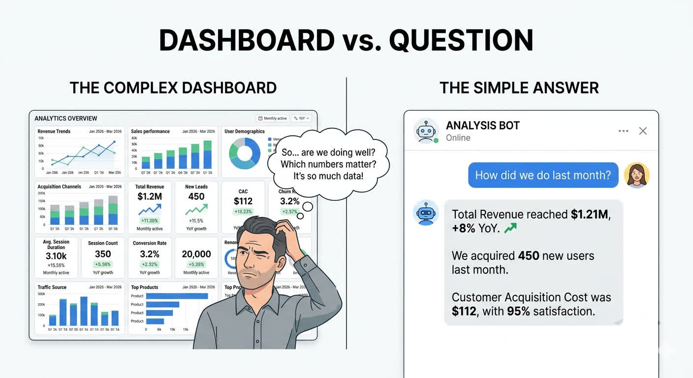
Checking a dashboard requires you to remember to check it, navigate to the right screen, recall what your baseline comparison should be, interpret a chart, and draw your own conclusions. That's five cognitive steps before you get to the actual decision you need to make. On a busy day, you skip it. Then you skip it again.
But even when you do check, there's a more fundamental problem. Dashboards answer questions you've already thought to ask. They show pre-defined metrics. They're good at "what was revenue last month?" because someone set up that chart.
They can't answer:
- "What should I be worried about right now?"
- "What changed this week that I didn't expect?"
- "Why did sign-ups spike on Thursday?"
- "Which marketing channel actually contributed to the deals that closed?"
Those questions require pulling data from multiple sources, doing analysis, and connecting dots. The dashboard just shows you the raw ingredients. You still do all the cooking yourself.
What Does the Alternative Actually Look Like?
The mental model shift that changed things for me was simple: instead of "which dashboard do I check?", the question becomes "what do I need to know?"—and then you just ask.
Here's what this looks like in practice.
You: "How did MRR change this week compared to last week?"
Agent: "MRR increased 3.2% week-over-week, from $47,200 to $48,710. This was driven by 4 new subscriptions ($2,100 in new MRR) offset by 1 churn ($590 MRR lost). The new subscriptions came primarily from the Product Hunt launch on Tuesday, which drove 340 visits to your pricing page. Source: Stripe billing data, queried at 9:14am."
That single answer required querying Stripe for current and previous week billing data, calculating the delta, breaking down what drove the change, cross-referencing with traffic data, and citing the source. No dashboard gives you that in one shot. To get the same answer manually, you'd open Stripe, pull up the billing overview, export a date range, open Analytics to check traffic sources, correlate the dates, and do the math. Fifteen minutes if you're fast.
The market is voting with its wallets. In 2026, Zylo found that spending on AI-native SaaS tools increased 108% year-over-year. Companies are shifting from tools that make you look at data to tools that think alongside the data.
This is what an agentic harness does. It sits on top of your existing tools and databases, understands your question in plain language, queries the right systems, and gives you a direct answer with sources. No chart interpretation. No tab-switching. No spreadsheet gymnastics.
Which Business Questions Does an Agent Actually Answer Better?
The questions that used to take me 15 to 30 minutes now take seconds. Here's the pattern.
"Which customers are at risk of churning?" This requires combining payment data (declining usage, failed charges), support data (increased ticket volume, negative sentiment), and product data (decreased login frequency). That's three different tools at minimum. An agent queries all three, scores the risk, and gives you a ranked list.
"How much did we spend on ads vs. the revenue they generated?" Ad spend lives in Google Ads or Meta. Revenue attribution lives in your analytics tool or CRM. Connecting them usually means UTM parameters, spreadsheet joins, and a lot of squinting. An agent does the join for you.
"Who signed up this week and hasn't activated yet?" Sign-up data lives in your auth system or CRM. Activation events live in your product analytics. Matching users across those two systems is the kind of unglamorous data work that eats hours.
Each of these questions currently requires 1 to 3 different tools, manual data wrangling, and enough context to interpret the results. With an agent sitting on top of your stack, each one is a single question with a direct, sourced answer.
How Do You Switch From Dashboards to an Agent?
You don't throw away your existing tools. Stripe keeps processing payments. HubSpot keeps managing leads. Your tools continue doing what they do well. What changes is how you interact with the information inside them.
Here's how to start without overhauling your stack:
Step 1: Identify your top 5 Monday morning questions. Write down the exact questions you answer every week as part of your business review. These are your highest-value targets. The agent doesn't need to replace every dashboard—just the ones that consume the most time.
Step 2: List the data sources each question touches. For each question, write down which tools you open to answer it. This is your integration map. A good agentic harness needs read-access to those sources—usually via API keys or OAuth, not a full migration.
Step 3: Start with read-only queries. The safest way to start is with a system that only reads data, never writes. Answer-only agents with source attribution let you validate the answers before trusting them for decisions.
Step 4: Track time saved, not just accuracy. In the first month, measure how long your Monday morning ritual takes before and after. Time saved is the clearest signal that the agent is actually replacing the tab-switching workflow, not just adding another tool to check.
Step 5: Add data sources one at a time. Start with the tool you check most often (usually Stripe or your primary analytics). Add a second source once you trust the answers from the first. Piecemeal expansion is faster and safer than an all-at-once migration.
If you want to understand what the architecture looks like under the hood—how agents handle context, tool use, and sandboxed queries—we wrote a detailed breakdown in From GPT Wrapper to Production Agent.
If you're a solo founder deciding which tools to keep and which to cut, see The Solo Founder's AI Stack in 2026 for a practical breakdown of what actually earns its place in a lean stack.
Is an Agent Right for Every Founder?
An agentic approach works best when your biggest pain is fragmented data across multiple tools—not when you have a single clean data source. If you only use Stripe and that's the only number you care about, a dashboard is probably fine. The agent becomes worth it when you're crossing 3 or more data sources to answer routine questions.
Dashboards still make sense in specific situations: public-facing metrics pages, investor reports with fixed KPIs, or real-time operational monitoring where a glance is faster than a question. The goal isn't to eliminate dashboards entirely—it's to stop building the ones nobody checks.
If you want to understand what an agentic harness is at a deeper level—what it actually is and how it works—start with What Is an Agentic Harness?.
Frequently Asked Questions
What is dashboard fatigue and why does it happen in 2026?
Dashboard fatigue happens when the number of dashboards in your stack exceeds your capacity to monitor them consistently. In 2026, the average organization manages 305 SaaS applications (Zylo, 2026 SaaS Management Index), each with its own metrics view. The cognitive overhead of logging in, recalling baselines, and interpreting charts on 10+ separate tools leads most users to simply stop checking. The result is 53% of licenses going unused for a full year (BetterCloud, State of SaaSOps).
Can I use an AI agent without replacing my existing tools?
Yes. An agentic harness sits on top of your existing tools—it reads from them via API connections rather than replacing them. Stripe keeps processing payments, HubSpot keeps managing contacts. The agent just aggregates and answers questions across all of them from a single interface. You don't migrate your data; you add a conversation layer on top of it.
How is an AI agent different from a BI tool like Looker or Tableau?
BI tools require you to pre-define the questions you want answered—someone builds a dashboard for "monthly revenue" or "weekly sign-ups," and you check those charts. An agent answers questions you haven't pre-defined. You can ask "why did churn spike last Tuesday?" and get an answer that cross-references payment data, support tickets, and product usage in real time. BI tools also require ongoing setup and maintenance as your data model evolves; an agent adapts as you add new data sources.
What data sources can an agent connect to?
The most common integrations are payment processors (Stripe, Paddle), CRMs (HubSpot, Salesforce, Pipedrive), analytics tools (Google Analytics, Mixpanel, Amplitude), support platforms (Intercom, Zendesk), and databases (PostgreSQL, MySQL, Supabase). Most agents use API connections or MCP (Model Context Protocol) servers—there are now over 10,000 public MCP servers covering most major SaaS tools, which means integration setup is faster than it was even 12 months ago.
How do I know the answers an agent gives me are accurate?
Source attribution is the key signal. A reliable agent always tells you where a number came from—"Source: Stripe billing data, queried at 9:14am"—so you can verify it yourself. If the agent can't show you the source, that's a red flag. The architecture that makes answers trustworthy is described in detail in From GPT Wrapper to Production Agent, specifically the sections on sandboxed execution and audit logging.
The Tab Test
Here's a challenge. The next time you find yourself with 6 browser tabs open, copy-pasting numbers into a spreadsheet to answer a simple question about your own business, pause. Look at what you're doing. Count the minutes.
Then ask: is this really the best we can do?
The data is already there, sitting in tools you already pay for. The problem was never a lack of dashboards. It was the assumption that more dashboards would eventually add up to understanding. They don't. They add up to 15 logins and a Monday morning you'll never get back.
The answer isn't another dashboard. It's making the question easier to ask.
Sources
- Zylo. 2026 SaaS Management Index. zylo.com/blog/saas-management-index/ — Retrieved 2026-07-09.
- Productiv. State of SaaS Report. productiv.com/state-of-saas/ — Retrieved 2026-07-09.
- BetterCloud. State of SaaSOps. bettercloud.com/monitor/state-of-saasops/ — Retrieved 2026-07-09.
- VentureBeat / IBM. Why 87% of data science projects never make it into production. venturebeat.com/ai/why-do-87-of-data-science-projects-never-make-it-into-production/ — Retrieved 2026-07-09.